
One of the biggest problems I've run into is that products, features, and improvements get shipped constantly, but there's only so much time to create marketing around them.
On the flip side, content teams are looking for genuine opportunities to create impactful content they can share across social channels and with customers. There's this disconnect: you're shipping features at an incredible pace, especially now with AI-assisted coding, but marketing can't keep up.
Ramp's coding agent wrote 30% of their merged frontend + backend PRs last week. Engineering is shipping faster than ever. Marketing velocity hasn't caught up.
See the source
The craft of engineering is rapidly changing. At @tryramp, we built our own background coding agent to accelerate faster.
— Zach Bruggeman (@zachbruggeman) January 12, 2026
We call it Inspect. It wrote 30% of merged frontend + backend PRs in the past week.
What if you could fix that at scale? That's what I built with PersonaBox.
I recently set out to take on product marketing for new features across 23 companies. Yesterday I ran the first one: Tiptap. Using PersonaBox, I generated 9 product updates from their recent PRs, and I want to walk through what I think makes a good product update.
Shipping fast, announcing slow
Here's the fundamental problem: engineering teams are shipping constantly. PRs are getting merged every day. But the vast majority of that work never gets communicated to customers.
It's not that marketing doesn't want to tell these stories. They desperately do. But creating a polished product update takes coordination between product, design, and marketing. That coordination is expensive, so it only happens for the "big bang" launches.
Meanwhile, customers are left wondering: "Is this team even working on the things I care about?"
Context is everything
So what makes a good product update? It all comes down to context. There are four things you need:
1. Buyer / user context
Deeply understand who your customers and buyers are
2. Feature context from code
The source of truth for what changed and why
3. Branding
Your brand's visual identity and partner branding
4. Content guidelines
How you talk about your brand and products
You want it to "sound like you." Let's break each of these down.
1. Buyer / user context
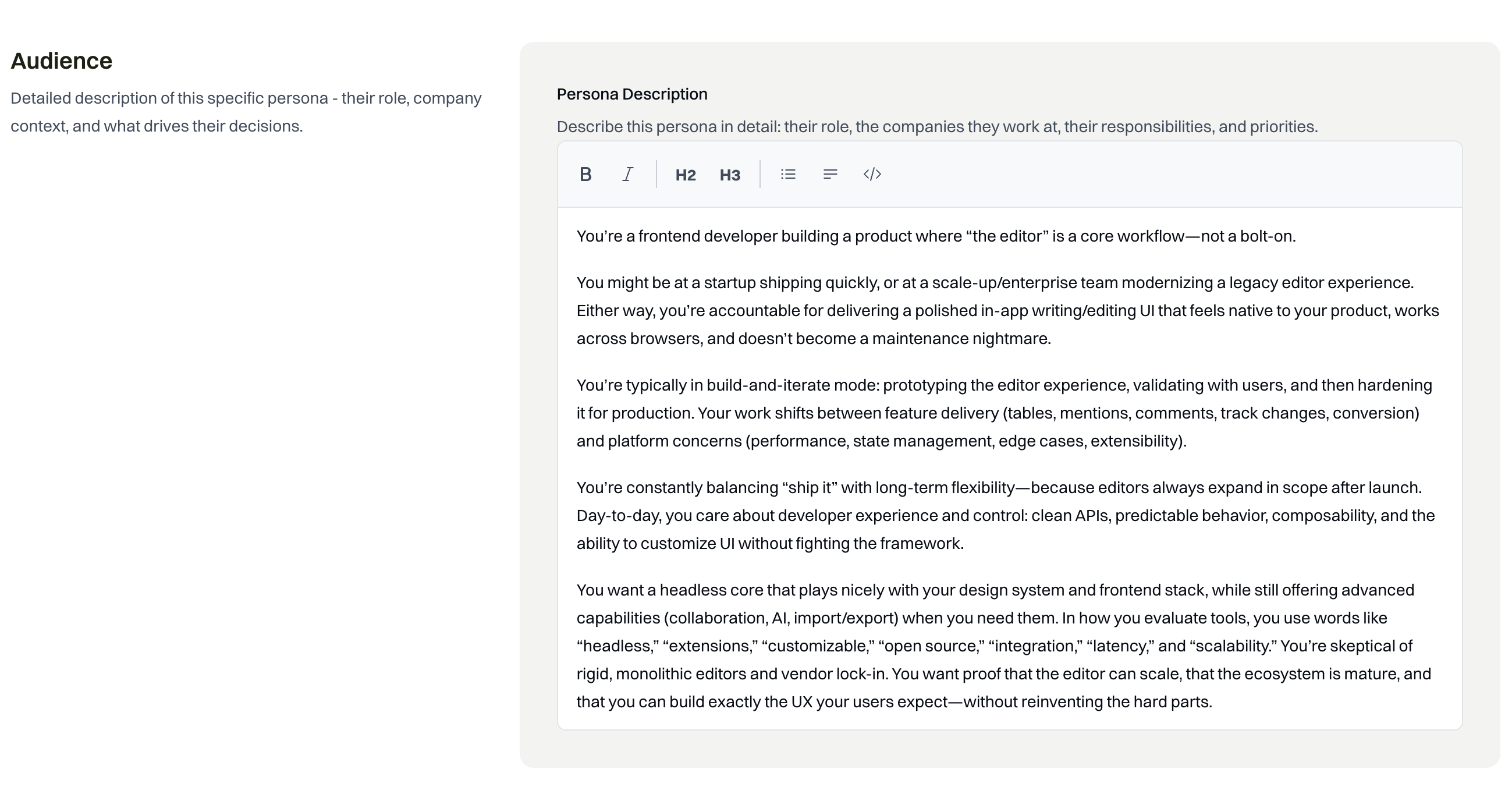
I use Tiptap, I'm a user. But I'm not an expert in all of their users. So I had to make some guesses, and the persona I chose was generated for me by PersonaBox.
If I worked at Tiptap, I'd probably know a lot more about our users, their use cases, and their problems. But for this, I used the persona of a frontend developer building a product where the editor is a core workflow.
Not just any frontend developer. Specifically one at a company like Notion, where the text editor is a core part of the product. This is different from someone who just throws an editor into their app quickly.
Persona messaging includes:
Core positioning
Voice & proof
Outcome pillars (2-4 pillars)
Tiptap messaging example
See outcome pillar example
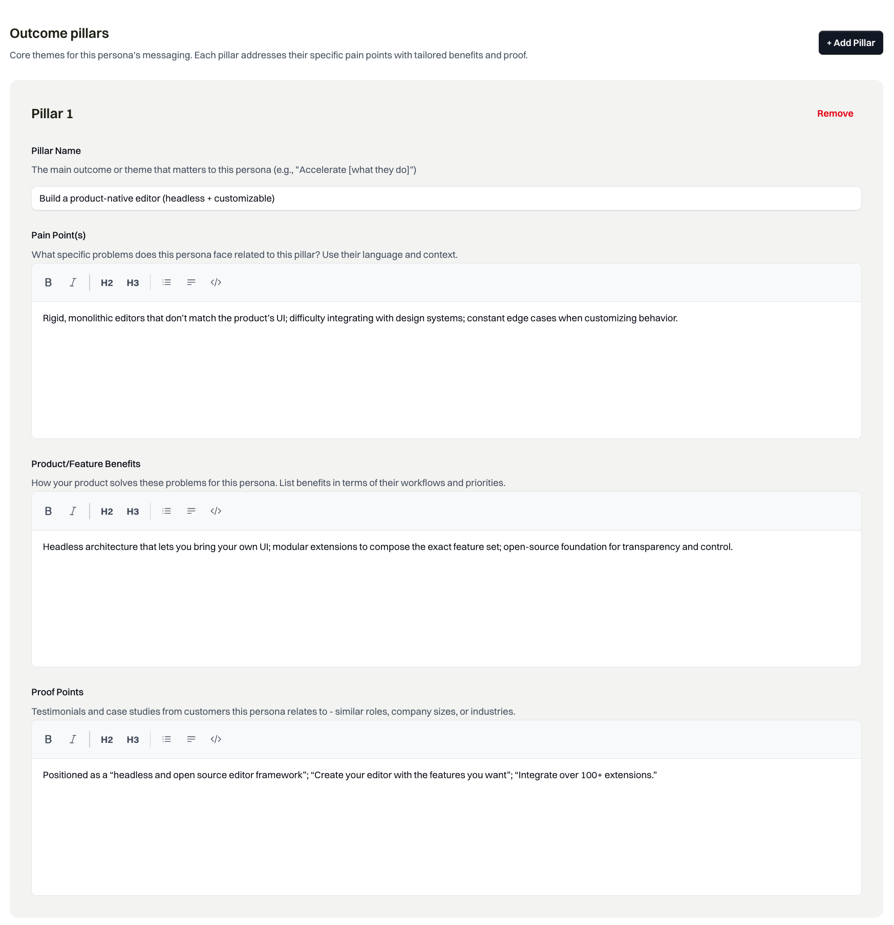
Outcome pillar: pain points, benefits, and proof points
2. Feature context from code
The source of truth for any feature is your codebase. The actual code that gets shipped, plus the commit messages and PR descriptions, tell you exactly what changed and why.
Code and commit messages are obviously developer-friendly and internal. But from there, you can deeply understand exactly how the feature works with the rest of the system and start to infer why someone might use it compared to what existed before.
I've found before-and-afters to be a powerful way of explaining products to users in their context.
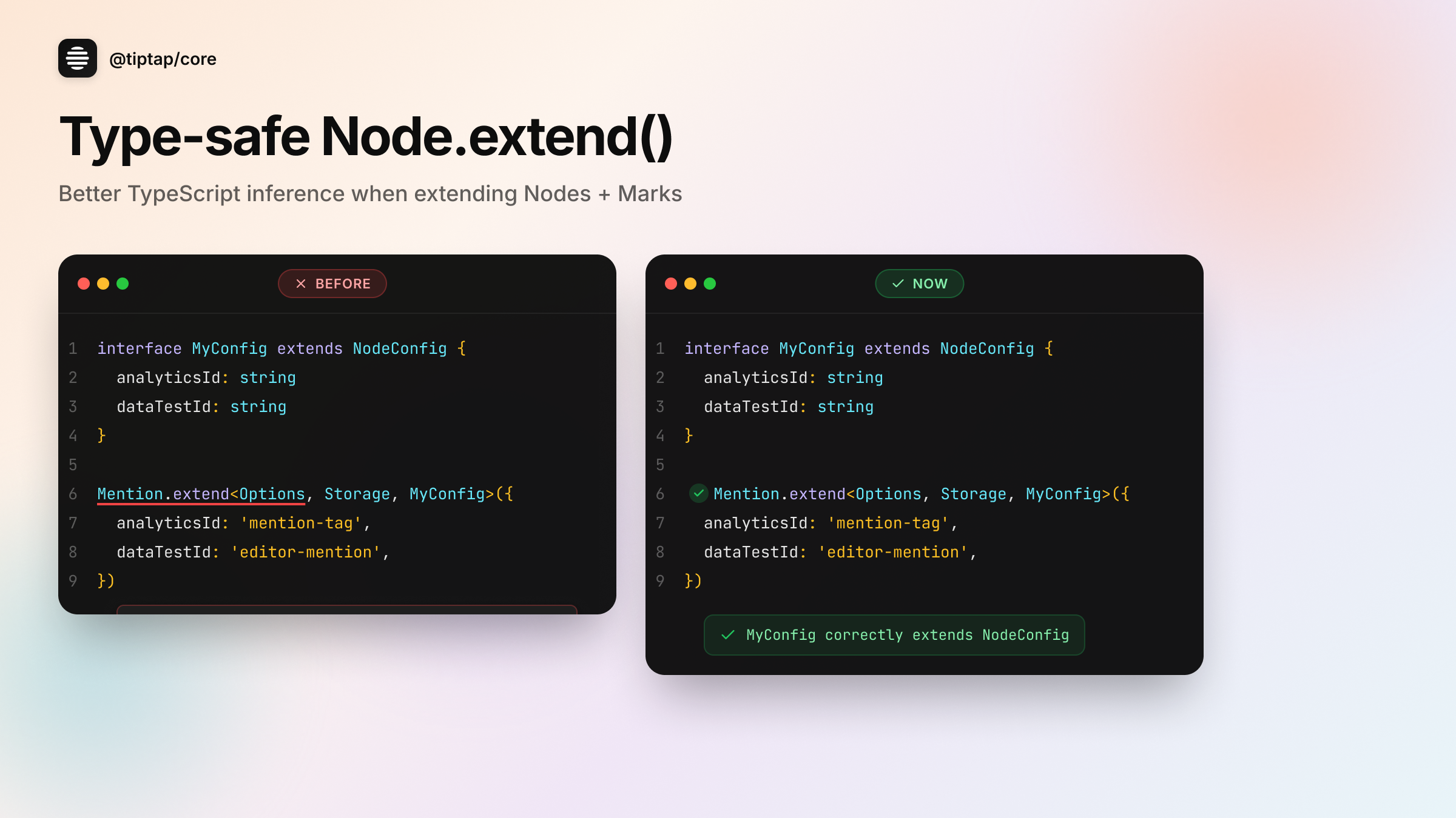
For example, Tiptap shipped better TypeScript inference for extending nodes. This isn't the kind of thing that makes it onto a roadmap or a big launch announcement. But for a frontend developer building a product where the editor is central to their app, this matters: they're constantly extending nodes to customize behavior, and catching config errors at compile time instead of runtime means fewer bugs shipping to production.
This is exactly why the codebase is the source of truth. These improvements get shipped constantly, and they're exactly what your users care about, even if they never make the marketing calendar.
Generated from PR
3. Branding
The key elements are color, font, and design motif. That's not necessarily in a design token file. This information gets pulled from multiple places:
- Your shipped product: What your actual app looks like is where you get the design motif
- Logos: More codified, often available via brand guidelines
- Design tokens: Fonts, spacing, colors from your codebase or design system
One thing that's important: when you're doing product updates frequently, I'd estimate 20% or more involve an integration or partner. So it's not just about your branding. It's about bringing their branding into it too.
These are all the things a human designer thinks about when creating a new visual. PersonaBox handles this automatically.
Branding in action
Dark mode Tiptap branding with partner branding
4. Content guidelines
As an extension of branding, content guidelines define how you actually talk about your brand. Questions to answer:
Is your brand playful or serious?
Are there words or phrases you avoid?
Does your audience want technical details?
Or do they just want to know the benefits?
You might already have a style guide. Or you might not. Either way, PersonaBox can review your website and existing content to understand how you write: the words you use, the tone you strike, the level of detail you include. It learns your voice so the output sounds like you wrote it.
Generated copy in Tiptap's voice
The copy opens with a pain point developers know, then introduces the solution. Technical but accessible, exactly how Tiptap talks to their audience.
Tiptap: 9 product updates in action
With all that context in place, here's what PersonaBox generated for Tiptap. Nine real product updates from their recent PRs:
Light mode examples
See copy
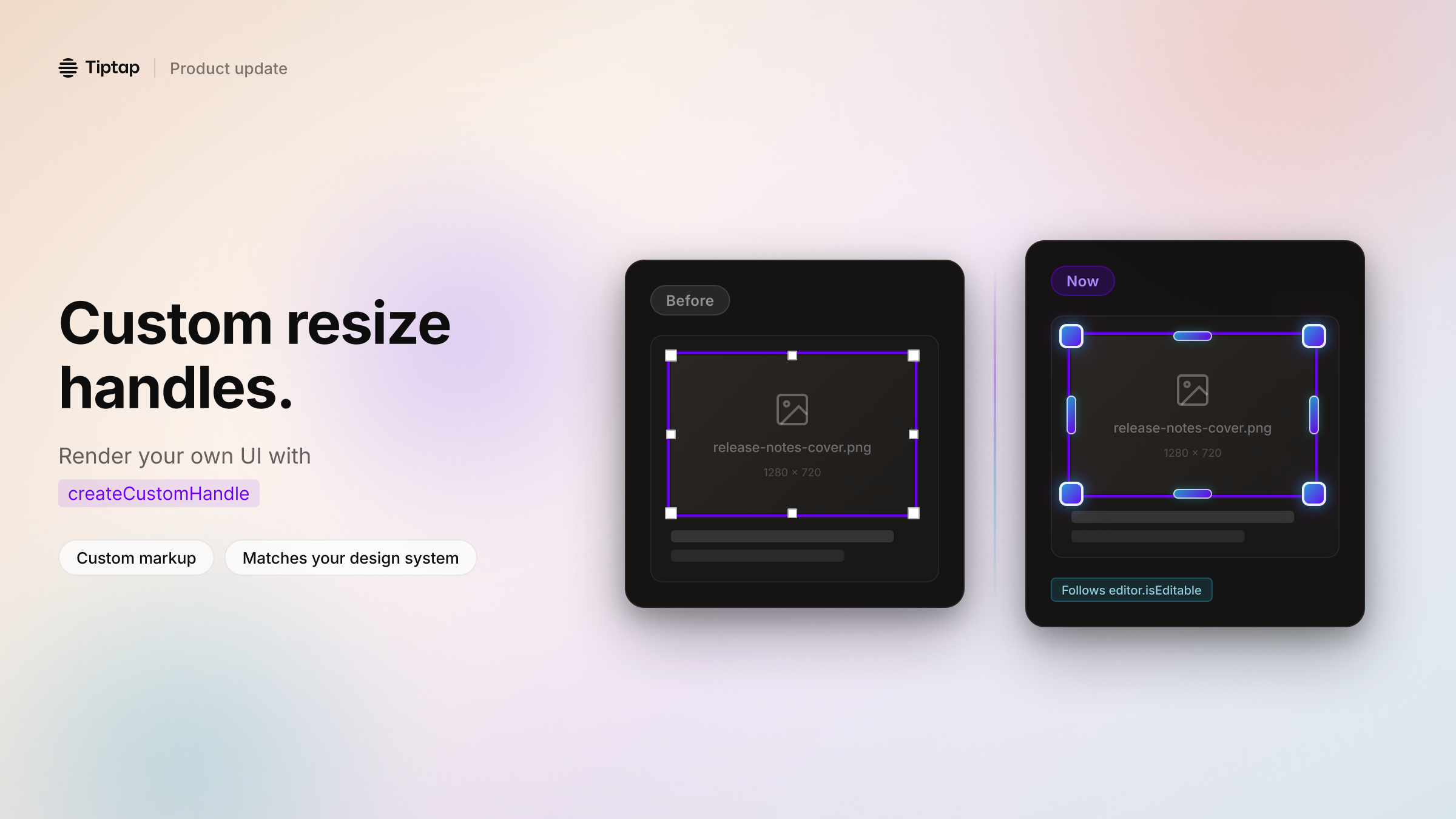
Build image resize handles that match your product UI. If you've ever tried to ship a Notion-style editor, you know the pain: the core editing experience can look great… and then resize handles show up that don't match your design system. Tiptap now lets you render your own resize handles in ResizableNodeView via createCustomHandle. What you get: • Full control over markup + styling for each handle direction • Custom positioning (when you provide a custom handle, Tiptap won't apply the default positioning logic) • Cleaner wrapper behavior (no more fighting inline styles with !important) • Handles that appear/disappear with editor.isEditable, so view mode stays clean Use it for corner dots that match your components, larger touch targets on mobile, or richer UX like tooltips and overlays.
See copy
TypeScript migrations are where small typing gaps turn into big time sinks. If you're moving a production editor to Tiptap v3, you'll often do the most "Tiptap" thing possible: extend built-in Nodes and Marks to add your own config. Example: • extend Link / Mention • add app-specific config like analyticsEventName, dataTestId, or stricter attribute typing We've shipped a small patch in @tiptap/core that improves TypeScript inference for Node.extend() and Mark.extend(). What changed: • ExtendedConfig is now constrained to extend NodeConfig / MarkConfig • parent node types flow into your extended extension more reliably • fewer manual casts and less "fight the compiler" while iterating This is a type-only improvement with no runtime behavior changes.
 See copy
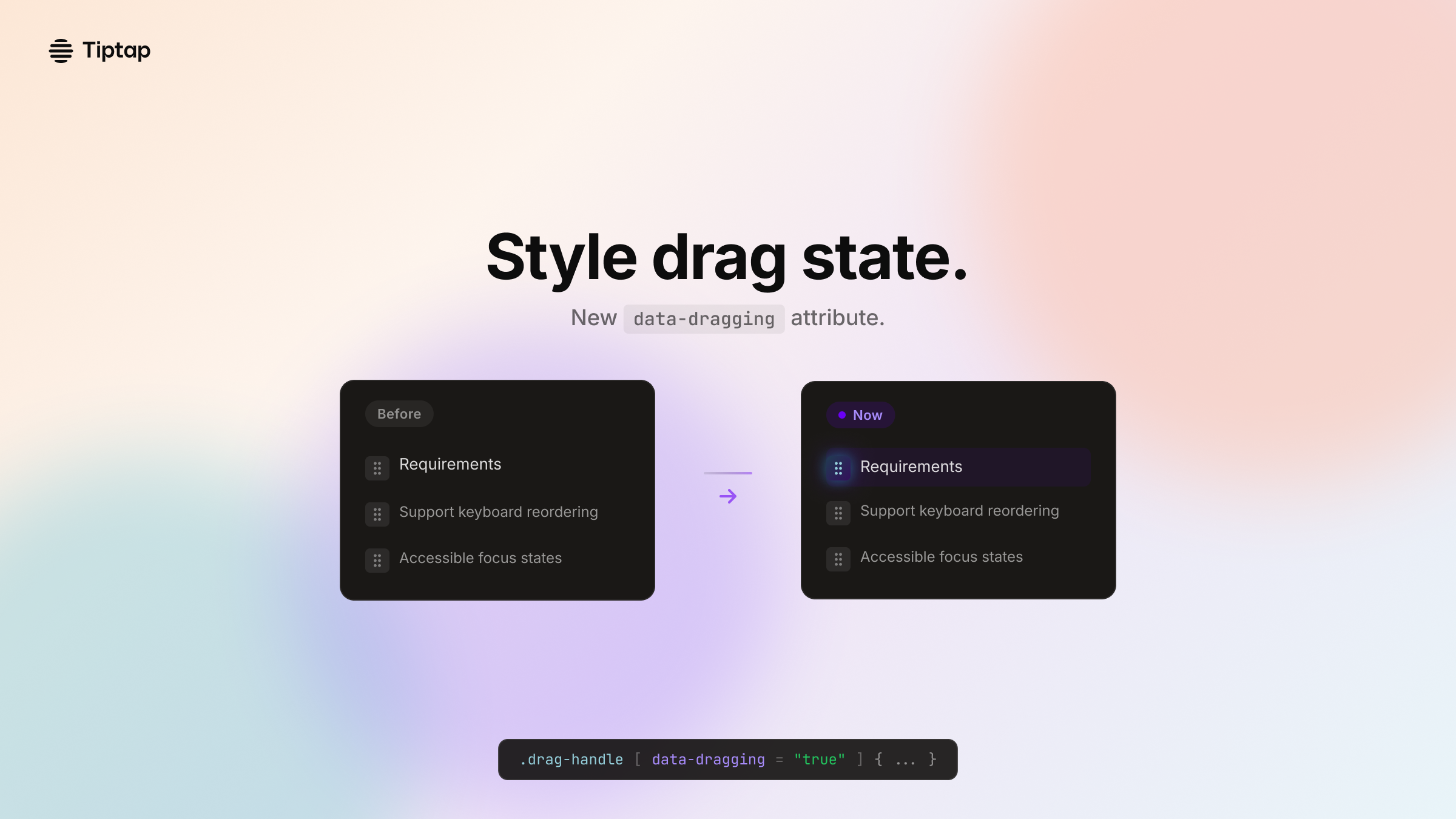
Build better drag-and-drop feedback in your editor without wiring extra state through your UI. We shipped a small update to Tiptap's Drag Handle that makes a big difference in polish: drag handles now expose a data-dragging attribute. Why it matters: Drag-and-drop UX usually needs a "dragging" state so you can change styles and avoid accidental interactions (tooltips, menus, click handlers) while a block is moving. Now you can hook into that state directly from the DOM: • data-dragging="false" by default • flips to "true" on dragstart • resets on dragend What you can do with it: • Style active drag with CSS: [data-dragging="true"] { … } • Gate event handlers to prevent mis-clicks during reordering • Write more stable Playwright assertions for "drag started/ended" It's consistent across React, Vue 2, and Vue 3 bindings.
 See copy
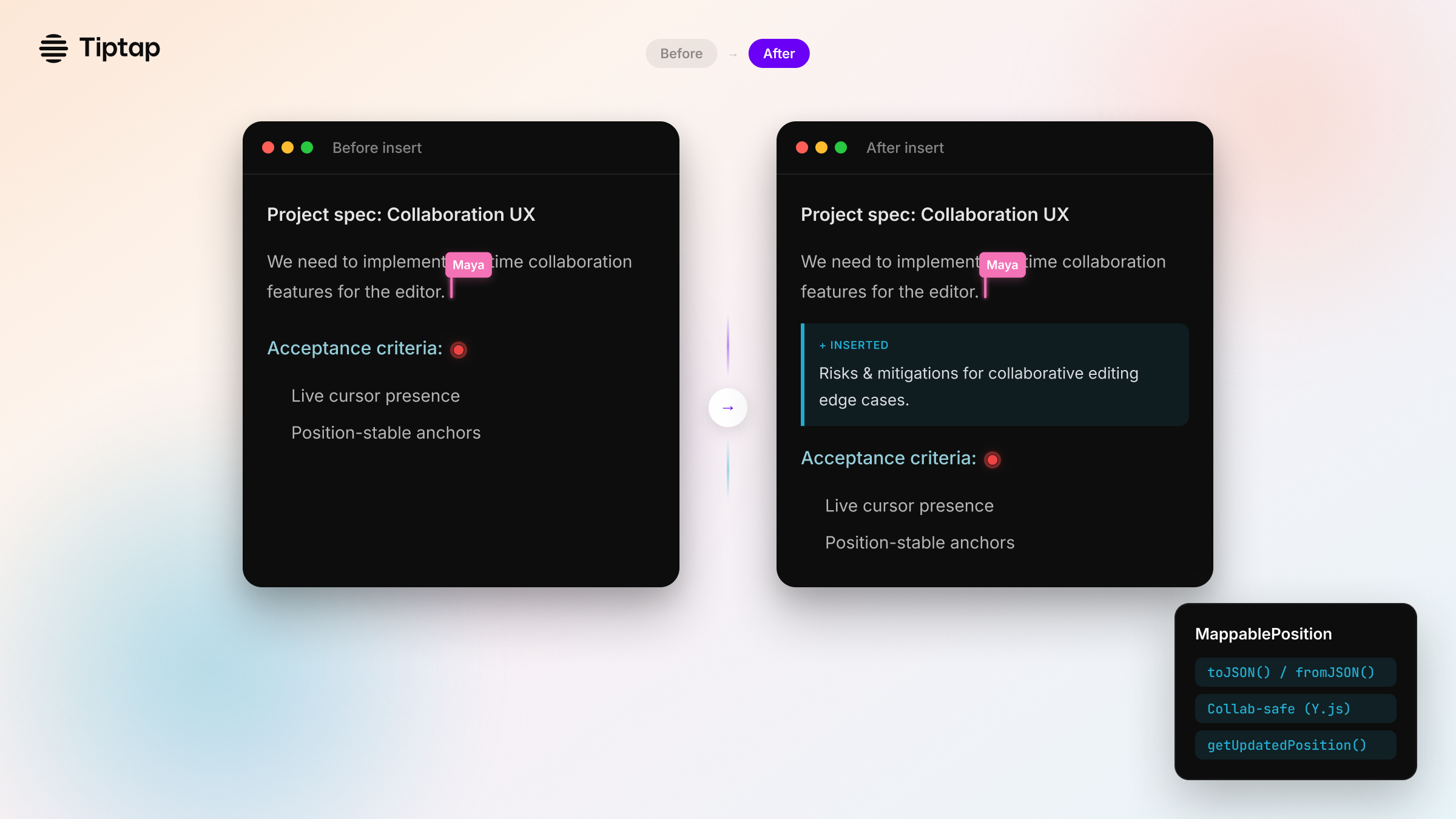
If you build collaboration features, you've seen this bug: A cursor, comment anchor, or decoration is "pinned"… until someone types above it. Then it drifts. We shipped a new way to track positions across transactions in Tiptap: MappablePosition. It wraps a position in an object that can be mapped safely as the document changes. The collaboration extension extends it with Y.js relative positions. What you can do with it: • Track anchors (comments, widgets, selections) through edits • Serialize positions with toJSON() / fromJSON() • Update positions with editor.utils.getUpdatedPosition(position, transaction) • Create them with editor.utils.createMappablePosition(number) This gives you a cleaner API surface for plugins and advanced workflows, especially in real-time collaboration.
 See copy
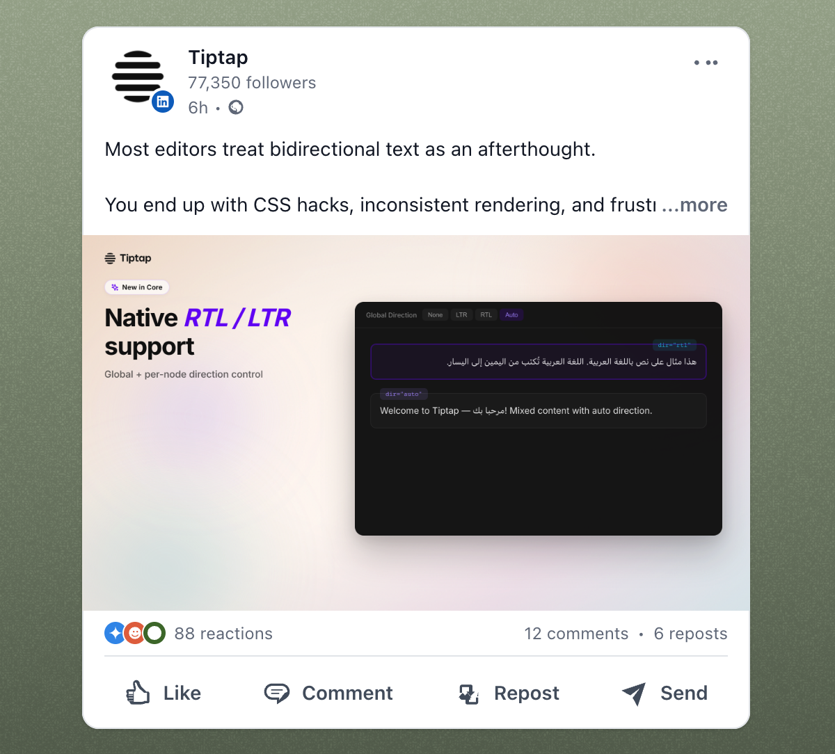
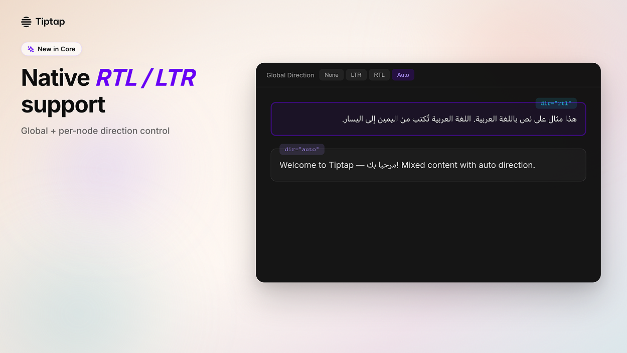
Build editors that work for everyone, including right-to-left languages. We just shipped native RTL/LTR text direction support in Tiptap Core. The problem: Most editors treat bidirectional text as an afterthought. You end up with CSS hacks, inconsistent rendering, and frustrated users writing in Arabic, Hebrew, or mixed-language content. What we built: → Global direction control: Set textDirection to 'ltr', 'rtl', or 'auto' for all content → Per-node direction: Apply direction to specific blocks with setTextDirection() command → Native dir attributes: Proper HTML semantics, not CSS workarounds → Auto-detection: Let the browser handle bidirectional text automatically Perfect for: • Knowledge bases serving global teams • Support ticketing with multilingual content • Documentation editors • Any app with users writing in RTL languages
Dark mode examples
See copy
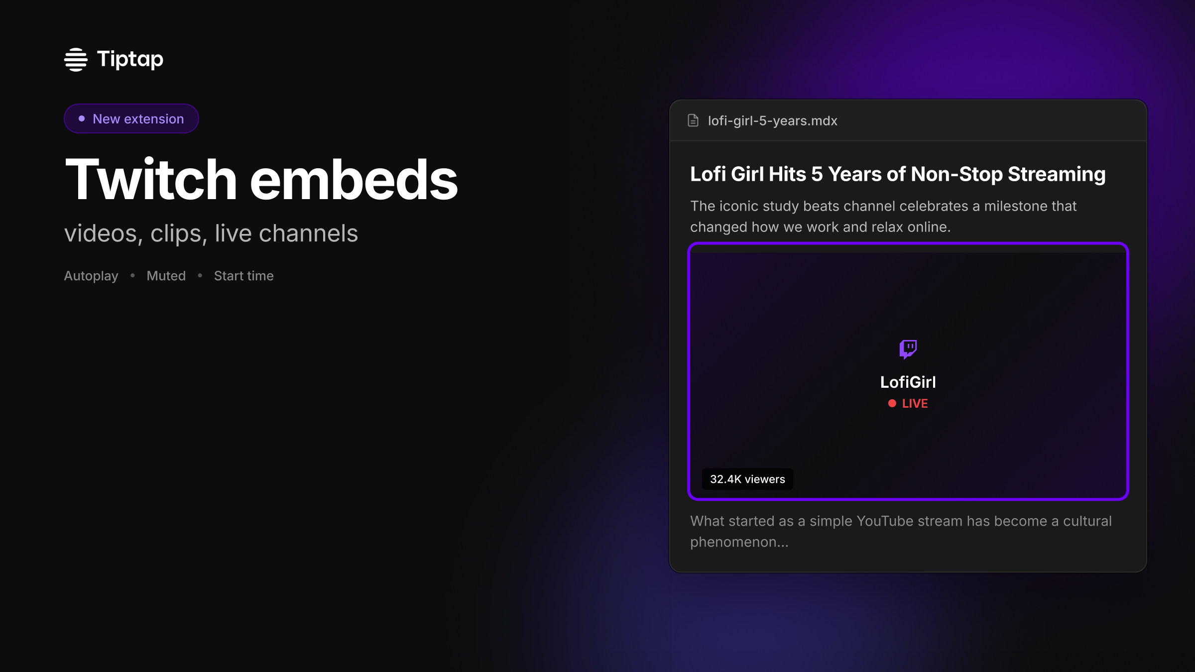
Embed Twitch content directly in your editor, without custom iframe glue. Tiptap now has a new extension: @tiptap/extension-twitch. If your product includes docs, knowledge bases, community posts, or creator workflows, Twitch links usually end up as plain URLs (or a fragile embed hack). With the Twitch extension, you can add rich embeds as a first-class node in your Tiptap setup. What you can build with it: • Embed videos, clips, and live channels • Auto-detect Twitch URLs on paste • Configure playback options like autoplay, muted, and start time • Override options per embed (attribute-level overrides) • Use it in React and Vue demos, with Markdown support for atom blocks Add it when you need it, just like any other Tiptap extension.
 See copy
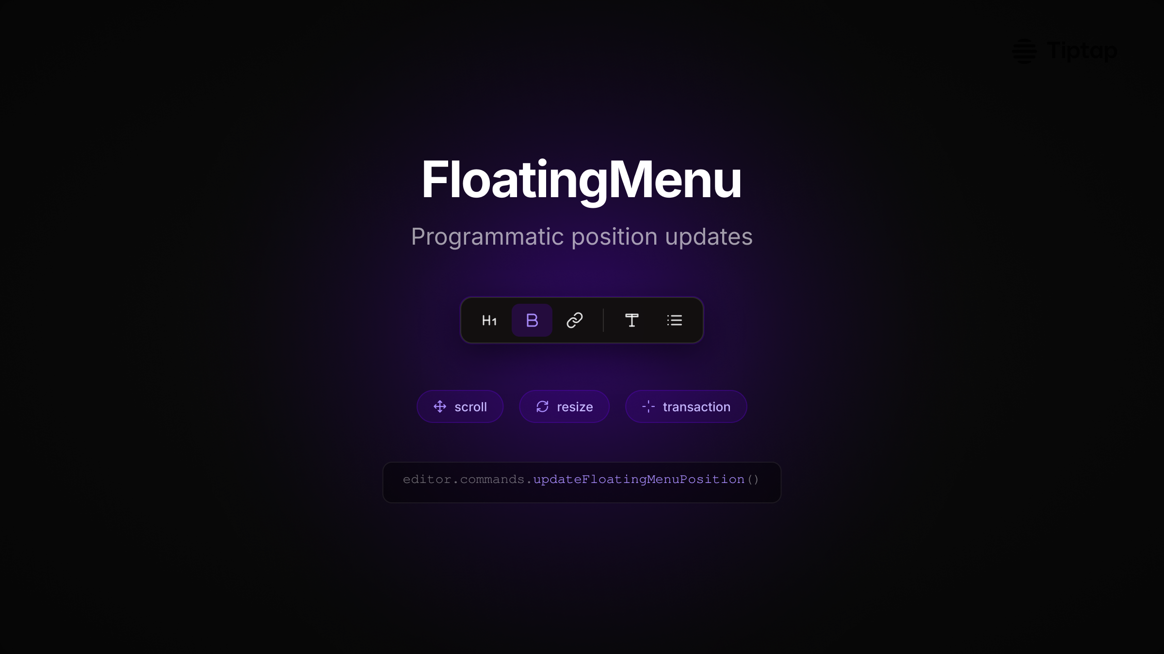
FloatingMenu now repositions on transaction, scroll, and resize. If you've built editors inside nested scroll containers or dynamic layouts, you've hit this: the floating menu drifts when the container scrolls or the layout shifts. We added programmatic position updates to FloatingMenu, bringing it to feature parity with BubbleMenu. What you can do now: • Trigger position updates via transaction metadata • Handle scroll in nested containers with scrollTarget • Control update timing with updateDelay and resizeDelay • Build reliable UX in complex app shells One line to force a reposition: editor.commands.updateFloatingMenuPosition() Works in React and Vue. Menu stays anchored where it should, even when your UI moves.
 See copy
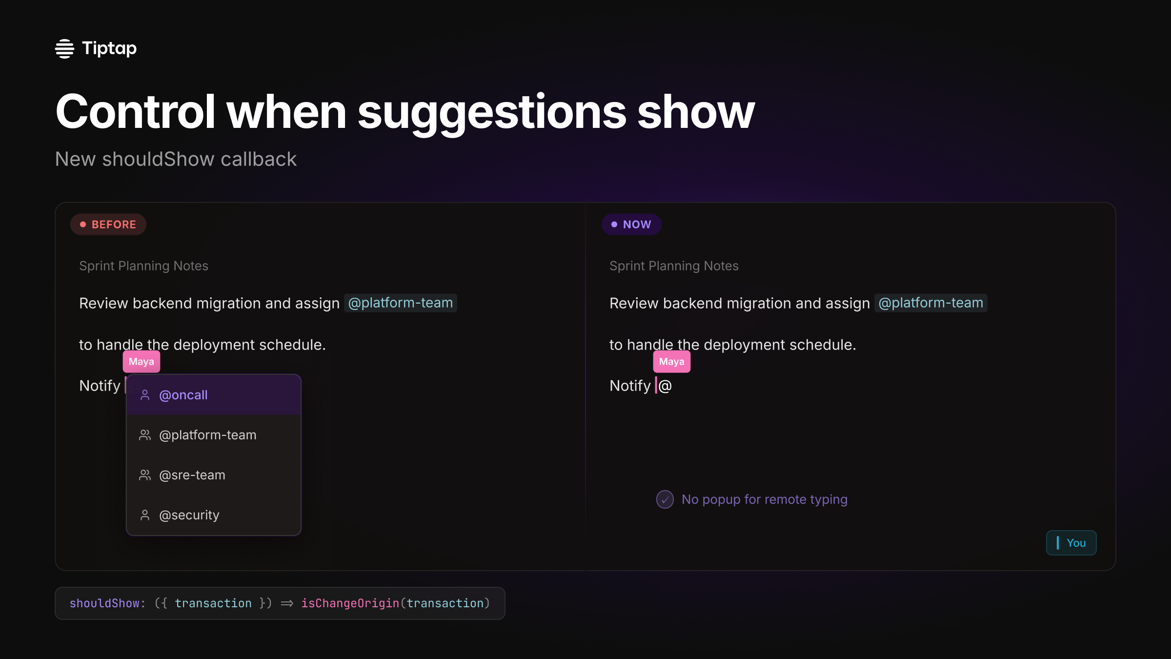
Build collaborative docs without phantom autocomplete. If you've shipped mentions or slash commands in a real-time editor, you've seen it: a remote user types "@" and everyone else gets a suggestion popup. We added a new shouldShow callback to the Tiptap Suggestion utility so you can control when suggestions become active. Use it to: • prevent mention/autocomplete UI from opening for remote users in collaborative docs • gate suggestions to local input only (via transaction) • keep the document content in sync without distracting UI side-effects Example: shouldShow: ({ transaction }) => isChangeOrigin(transaction) If you're building a Notion-like editor, this is a small hook that makes collaboration feel polished.
 See copy
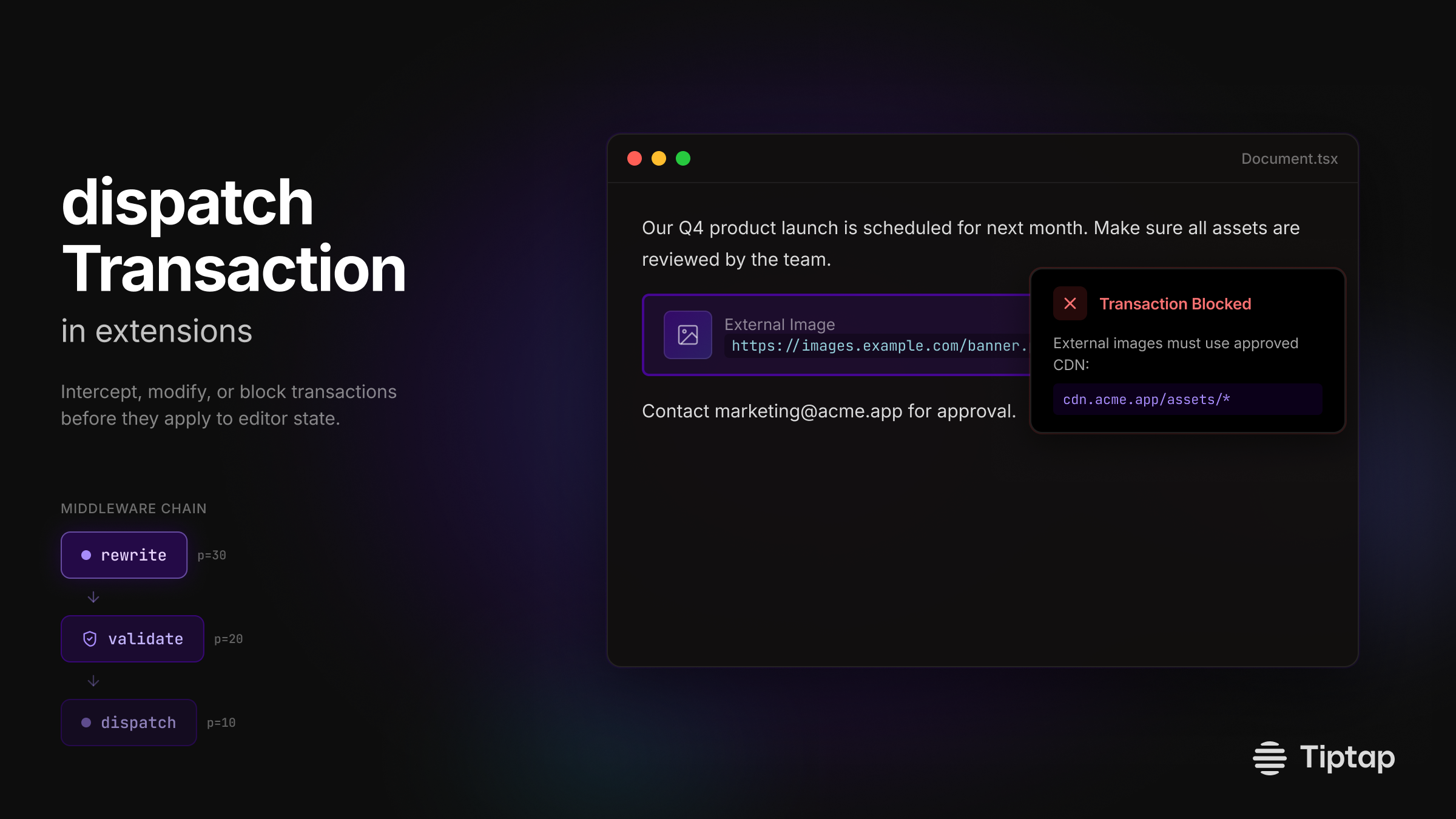
Build extensions that intercept transactions before they hit editor state. We shipped dispatchTransaction in extensions: a middleware-style hook that gives you control at the transaction layer. What this unlocks: • Validate content before it applies (block external image URLs) • Rewrite transactions on the fly (auto-fix formatting) • Chain multiple handlers with priority ordering • Skip calling next() to block unwanted changes Real use case: enforce that all images come from your CDN. Block the paste, show a message, done. Middleware composition means each extension handles its concern, then passes the transaction along. Priority controls execution order. New in @tiptap/core.
You might notice small things that need tweaking. For example, the Tiptap logo appears in slightly different positions across these examples, or a specific logo variant might not match your brand guidelines exactly. That's expected. Everything exports to Figma with one click, so you're never locked in. Every element is fully editable.
Each of these includes multi-channel copy (LinkedIn, Twitter, newsletter) and on-brand visuals ready to share. The copy speaks to the frontend developer persona, highlights the benefits in their context, and sounds like Tiptap.
9
Product updates generated
3
Channels per update
1
Click to Figma
Try it yourself
Tiptap is one of 23 companies I'm running through PersonaBox as part of this experiment. The pattern holds: give the system the right context, and it produces product updates that actually sound like the brand.
If you're shipping features faster than you can announce them, this is what PersonaBox was built for. Connect your GitHub repo, set up your personas and branding, and let your PRs announce themselves.
Have questions or want to see your company as an example? Reach out on LinkedIn or book a demo.
- Mike