
I'd make a bet that most product update newsletters started because an ambitious, well-meaning employee decided "we should have a newsletter" — not because there was a burning need.
But consistently sending out product newsletters that no one opens or reads can hurt more than it helps by increasing opt-outs and taking away precious time from more important projects.
Do you even need a product update newsletter?
Before creating or optimizing your next product newsletter, answer this one question:
What do we hope a product update newsletter will accomplish that one-off product launch emails won't?
Some valid reasons include:
- Customers are at risk of churning because they don’t feel like we’re making consistent improvements to the product.
- We ship frequently enough that one-off launch emails would overwhelm inboxes, and we need a single, predictable touchpoint to bundle updates together.
- We’re consistently adding features that new users may not easily find in the product, or serving a market of users that doesn’t already regularly use our product.
If none of those sound like you, you might not need a recurring newsletter. A changelog page, an in-app banner, or a well-timed launch email could serve you better.
If those or another reason makes sense for you, continue.
8 lessons for creating a product update newsletter that people actually read
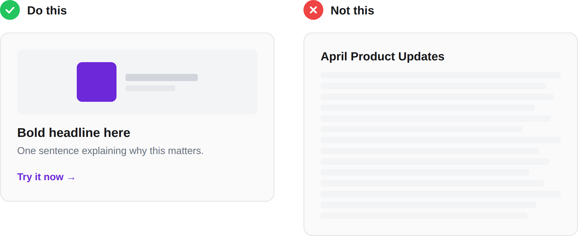
Lesson 1. No one reads anymore
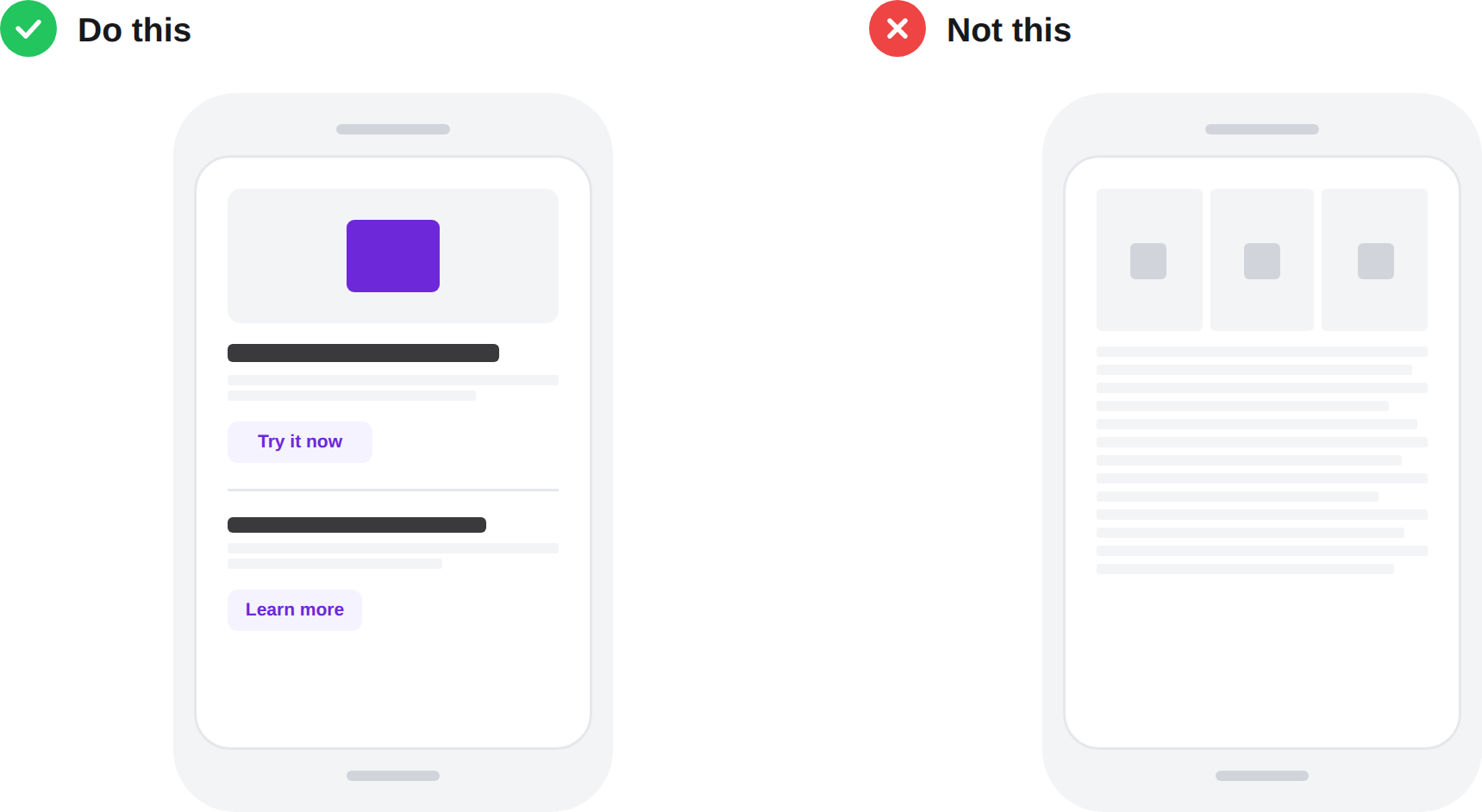
They briefly skim headlines to decide if they want to read more, and they split-second glance at images. Keep your newsletter concise, action-packed, and filled with genuinely useful images. Bold headline, one-sentence summary, a visual, a link. That's the whole experience for 80% of your audience, and that's fine.
If someone scrolls through your newsletter in 8 seconds and walks away thinking "oh cool, they added filters," that's a win.
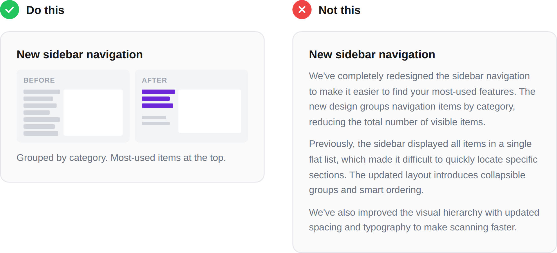
Lesson 2. Show the feature, don't describe it
A clean visual of the feature in context of a relevant use case does more work than any paragraph you could write.
"We've updated the navigation to make it easier to find your most-used features" is fine. But a side-by-side of the old nav and the new nav is instant comprehension. The bar isn't "perfection" — the bar is "faster than reading."
Lesson 3. Write update headlines at the right altitude
Somewhere between "Introducing Advanced Filter V2" and "Accelerate revenue faster." I like to have the headline answer "why does this matter?" once. Not twice. If you answer it twice, you're getting too high up.
Here's a brief example. Let's say your team just shipped a Salesforce integration:
"Introducing our new Salesforce integration"
"Sync your deals from Salesforce with a click"
"Spend less time on manual data entry"
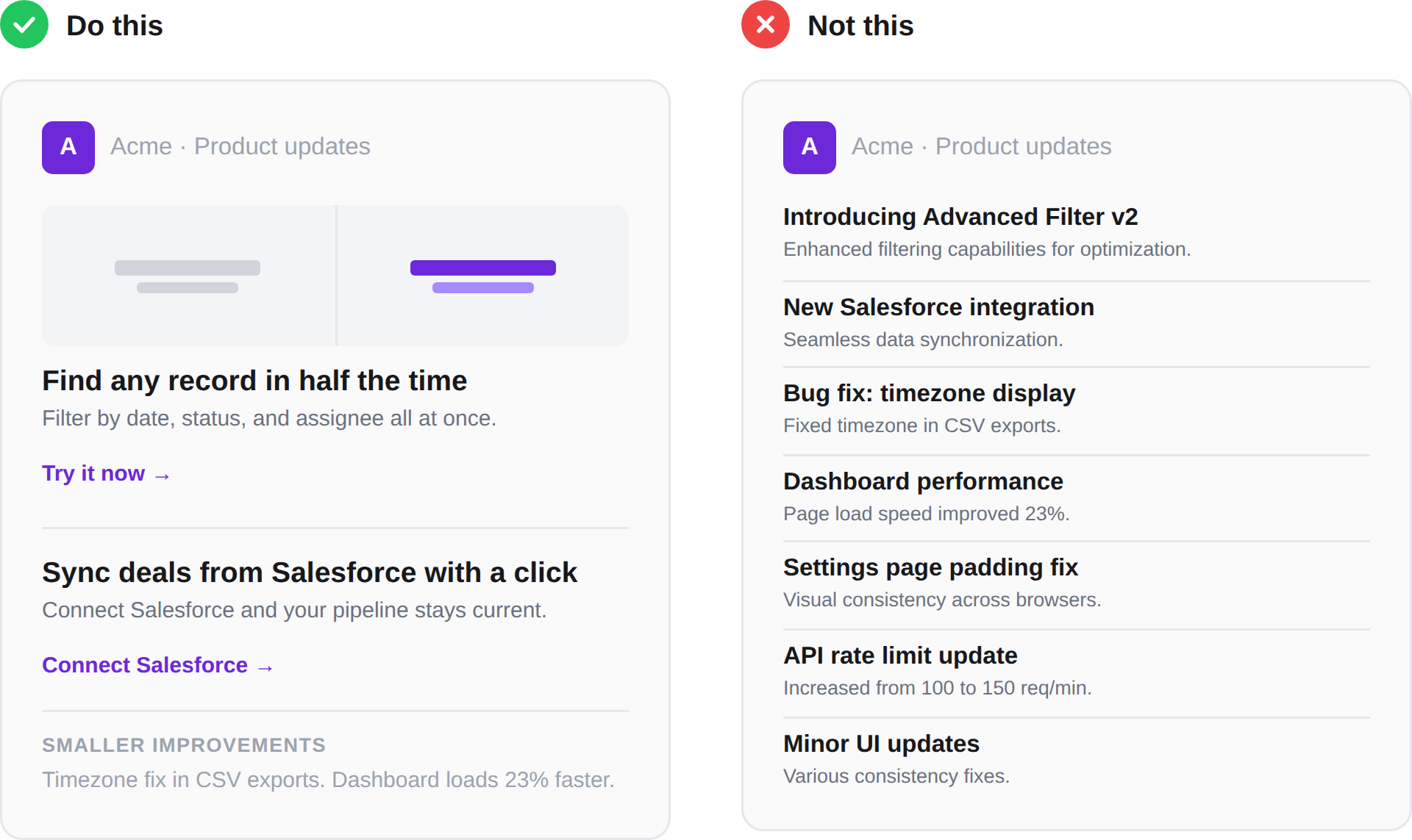
Lesson 4. Only include the good stuff
Your newsletter isn't your changelog. The newsletter should mention 1–5 (max) of the most interesting things you shipped. One rule of thumb is to pick the two or three updates that would make a customer say "oh nice" and cut everything else.
If you can't bring yourself to kill the rest, put them in a "smaller improvements" section at the very bottom, consider creating different newsletters for different audiences, or create an internal-only version with everything in it.
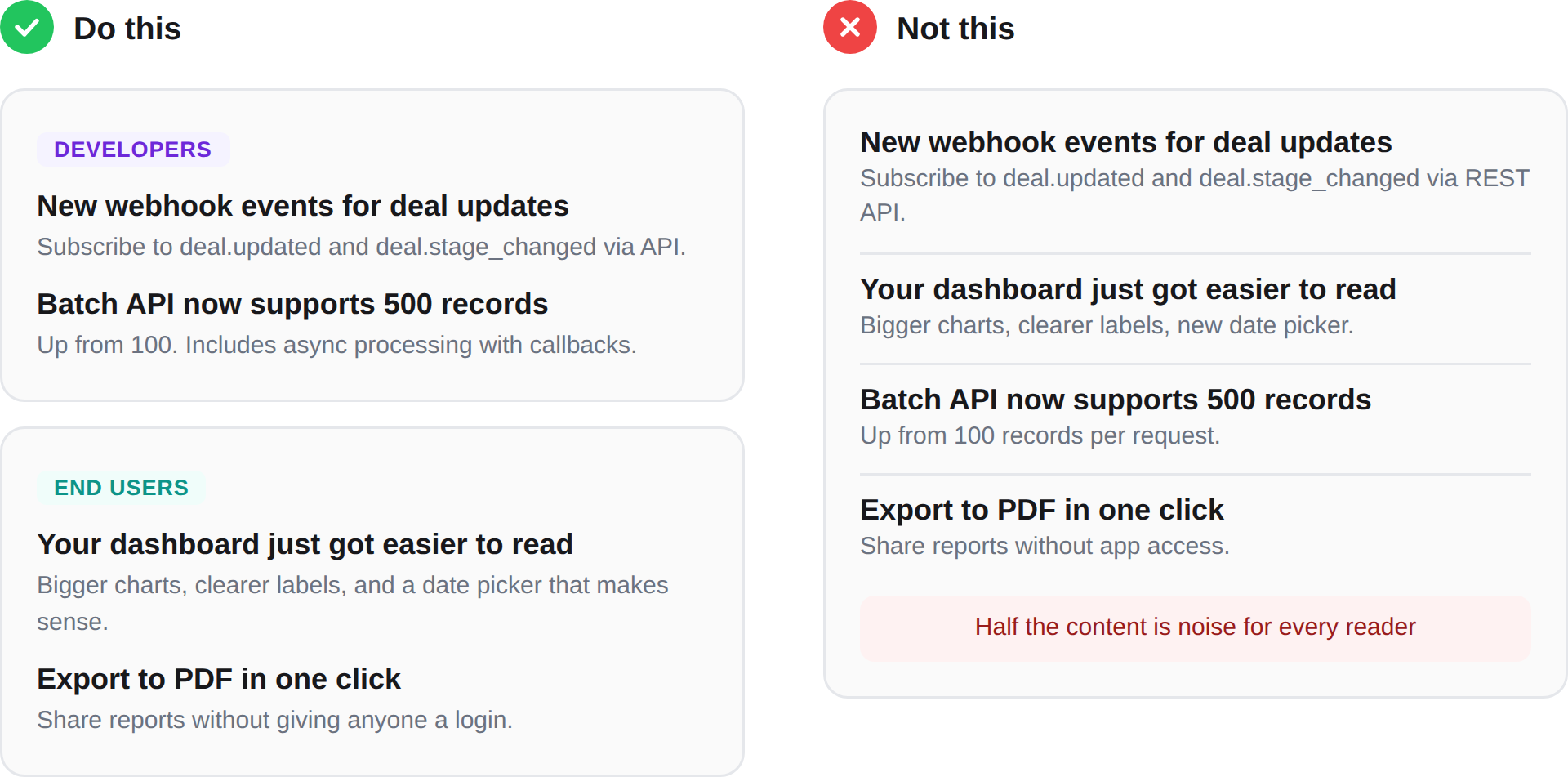
Lesson 5. Your power user and your casual user don't care about the same things
If you have to cater to one, cater to the casual user. Your power users are going to find the new API endpoint in your docs or your changelog anyway. The casual user needs to be told.
Also, if your product serves meaningfully different personas, consider splitting your newsletter into separate tracks. It's more work, but one relevant email beats one bloated email. If you can't segment, at least structure it so different audiences can self-select. Lead with the broadest, most universally relevant updates and push the deeper technical stuff to the bottom.
Lesson 6. Send it to yourself and read it from your mobile
Before you hit send, email it to yourself and open it on your phone. You'll immediately notice that it probably wasn't as skimmable as you thought. Paragraphs that felt short are suddenly walls of text, images that looked great are now impossible to read, and the three-column layout collapses into chaos.
Even if most of your recipients are reading this on their desktop, the mobile screen size often gives you a new perspective on it to help you tweak it.
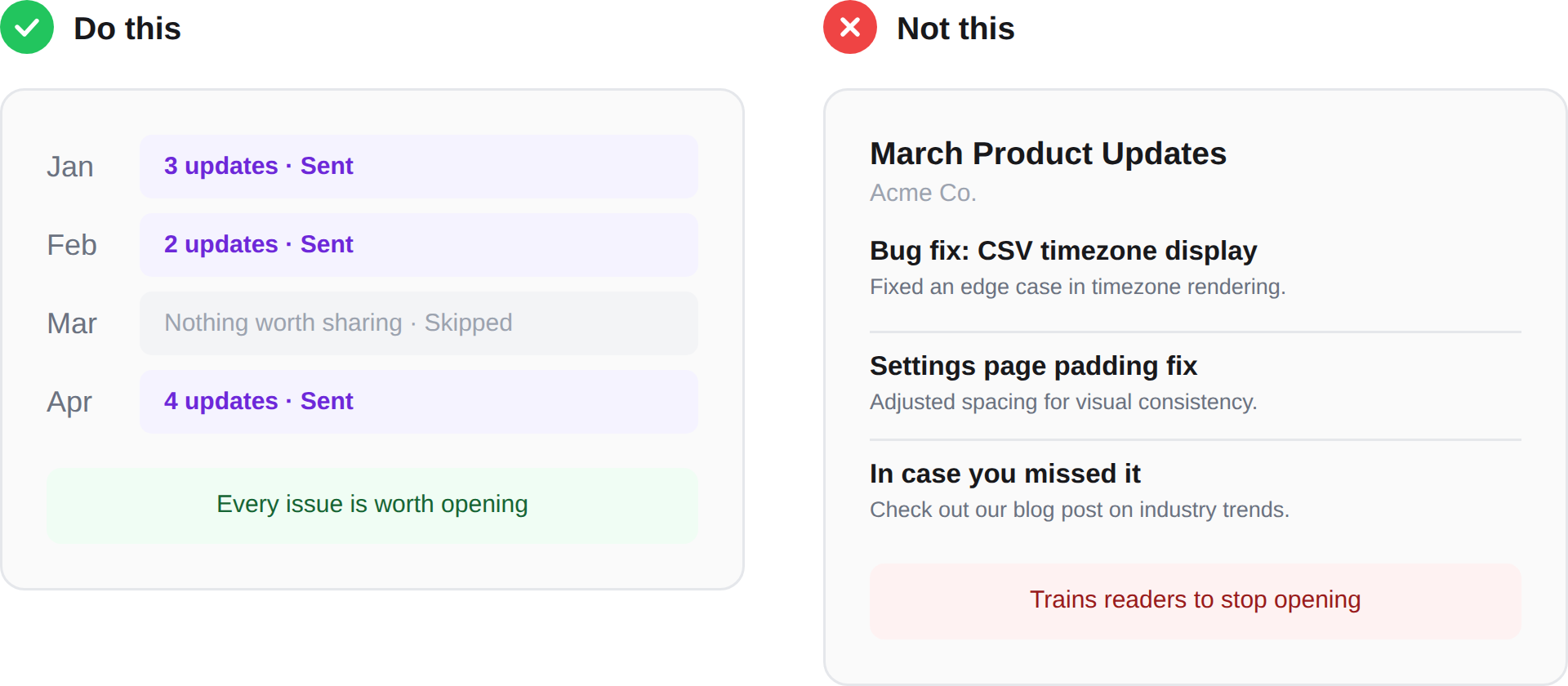
Lesson 7. Don't force it if you don't have anything worth saying
If your biggest update this month is a bug fix and a minor UI tweak, don't send a newsletter. Don't pad it with filler. Don't repurpose a blog post to fill the space. Your readers will see through it, and every low-value issue makes them a little less likely to open the next one.
Nobody is sitting in their inbox thinking "where's the product update?" But they do notice when every issue they open is worth their time (and vice versa).
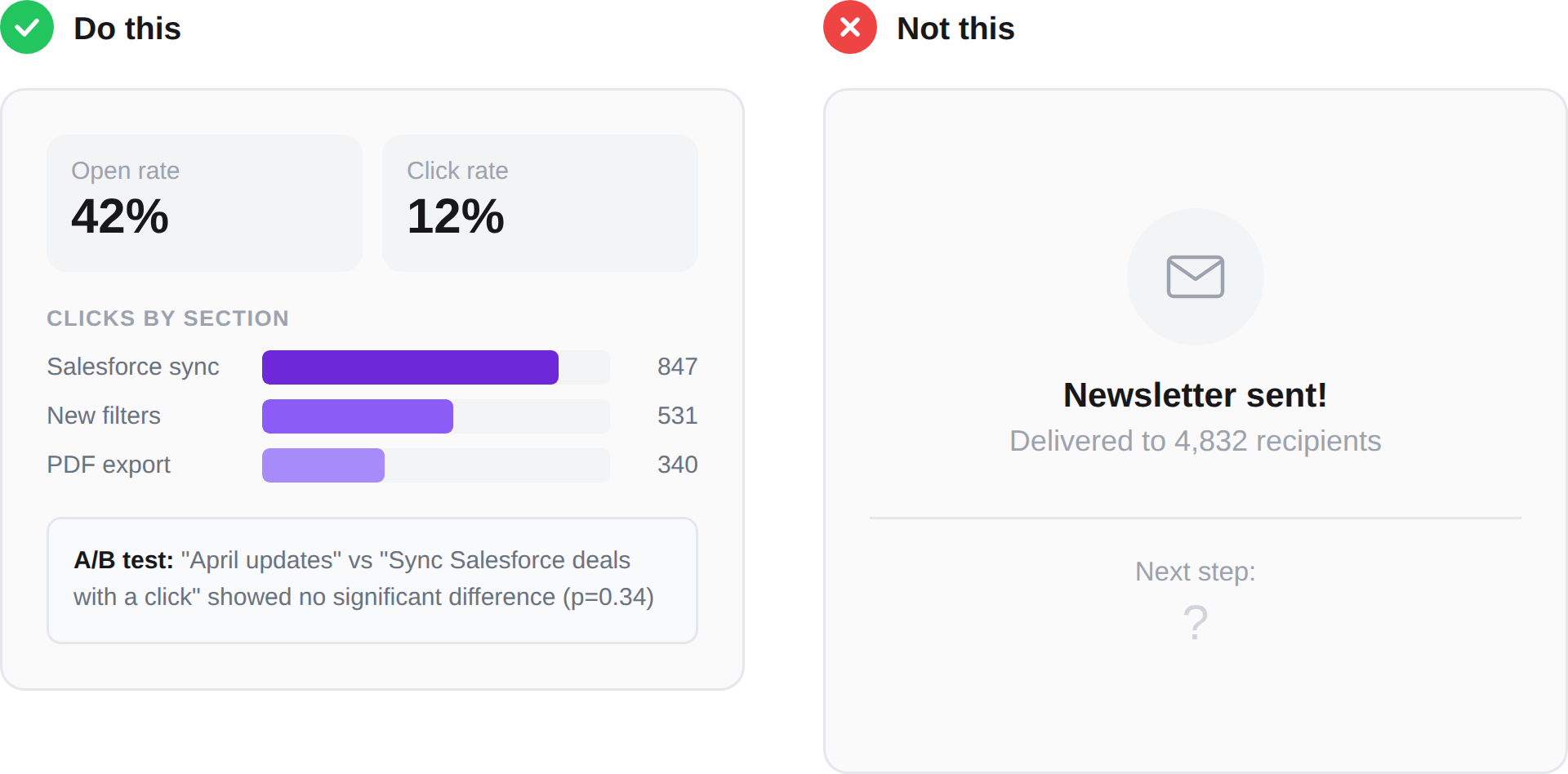
Lesson 8. Measure it like a product
Product newsletters are one of the best places to get statistically significant answers via A/B tests because your sample size is large, and it's a specific moment-in-time.
The most obvious thing to test is your subject line. We tested dozens over the years and found no statistically significant difference between a value-focused headline and a standard "[Company] April Product Updates" format, but your audience might behave differently. The only way to know is to test it.
Beyond subject lines, pay attention to what your readers actually click on that is low down. Things lower down on the newsletter should have much fewer clicks than those up top because lots of people won't scroll, so if you see the heatmap light-up lower down, you know you might have an unexpected feature that's worth promoting more.
Finally, roughly measure your time and effort going into these. If the juice isn't worth the squeeze, stop squeezing, or squeeze less hard (?). We found that though there were some positive statistical differences when we segmented, the time and effort our small but mighty team put into creating multiple newsletters for different audiences wasn't worth the relatively small increase in engagement.
This is actually one of the reasons we built PersonaBox. We were spending hours every month assembling product update content from pull requests and release notes, and wanted to see if we could cut that time down significantly.
Conclusion
If you take away one lesson from this: before you hit send on your next issue, read it as a customer who has 8 seconds and no context. If you'd scroll past it, so will they.
And if you're not sure whether your newsletter is working, ask yourself the question from the beginning: is this accomplishing something that a one-off email or a changelog page couldn't? If the answer is no, it might be time to rethink the format entirely. The best product update newsletter is the one people actually open and read. The second best is often no newsletter at all.
We can help with your product newsletter
At PersonaBox, we help SaaS companies turn their code changes into ready-to-send product update content. Changelogs, newsletters, LinkedIn posts, social assets. You ship the code, we help you tell customers about it.
If you're spending hours every month pulling together your product newsletter from Slack threads and JIRA tickets, take a look at personabox.app.